An application — fully developed from back-end, front-end, and UI/UX design — that helps people manage their day-to-day tasks and assess their progress over time.


Coming Soon!
This project isn't available right now. Something cool is in the works!


An application — fully developed from back-end, front-end, and UI/UX design — that helps people manage their day-to-day tasks and assess their progress over time.
Individual
4 weeks
After finishing my time at d1g1t Inc, I became extremely interested in learning more about how the different components of a fully-functioning, database-backed web application come together.
Therefore, I set out to explore the world of full-stack web development, combining my passion for UX Design and an eagerness to further my skills in web development.
I developed a todo app, focusing particularly on styling the UI according to different data states, as well as ensuring that all possible interactions were accounted for.
Through my time practicing UX Design, what I have realized is that Interaction Design plays a significant role in the overall flow and experience someone has within a product. After all, with no interaction, there is no experience, right?
Especially when it comes to displaying data, the time it takes to show information to a user is not perfectly reliable; as a designer, it is my responsibility to account for these micro-transitionary moments, and ensure that they are well designed.
I wanted to develop an application that had the potential to be of use to me right off the bat. By being back on a job search, I realized that a todo app could help me keep track of my tasks as I looked for my next opportunity.
Additionally, developing the todo app would give me the chance to develop an application of manageable complexity for its minimum viable product, which would allow me to focus on delivering the dynamically-served components of the full-stack application in tandem with pushing the boundaries of the app's UI and experience.

Having used Monday.com for managing tasks over time before, one of my favorite features was how progress towards completing all tasks is displayed.

Invisibility of UI inputs such as changing page name and adding a new table row, as well as under-the-hood processes like automatically saving user data, were things I wanted to bring into my app.

Adding new todo/list items is as seamless as adding a new line, and I wanted to bring this flow and experience to the greatest extent possible in my app.
In order to monitor progress and assess completion, I broke up my efforts into phases.
I first wanted to have a minimum viable product which would have foundational features such as toggling todo items and adding/removing them. This was done according to the following process:
After the minimum viable product features were rolled out, I created a process through which to develop subsequent features:

For those who aren't as familiar with tech jargon: think of an API like a waiter at a restaurant. The waiter receives your order and sends that order to the chef. The chef prepares your order and sends it back to you through the waiter. In this interaction, the waiter is the intermediary between you and the chef — and that is the role of an API between a user and the server/database.
For an application to be more than just a UI or front-end and work with a database, a back-end is necessary to develop. Moreover, defining an API allows requests to be made from the user to the database, and the responses resulting from those requests are dealt with by the back-end.
Before front-end code (UI, styling, etc.) was written, I built out what would be needed for the minimum viable functionality of my app.

While much of my efforts were focused on the programming itself, as a UX/UI Designer, it is natural for me to consider interface possibilities through low- and high-fidelity designs. Depending on the complexity of features and components of the UI, I took designs to different levels of fidelity before building them out with code.
I used sketches to get a better sense of how the main UIs of the app (i.e todo list, "Add New Todo" component, sets) could look.
This also involved the consideration of different design possibilities. For instance, to help with making a decision regarding how to show a running list of todos, I ran a quick A/B Test through my partner to understand what UI would better suit their needs and information processing.
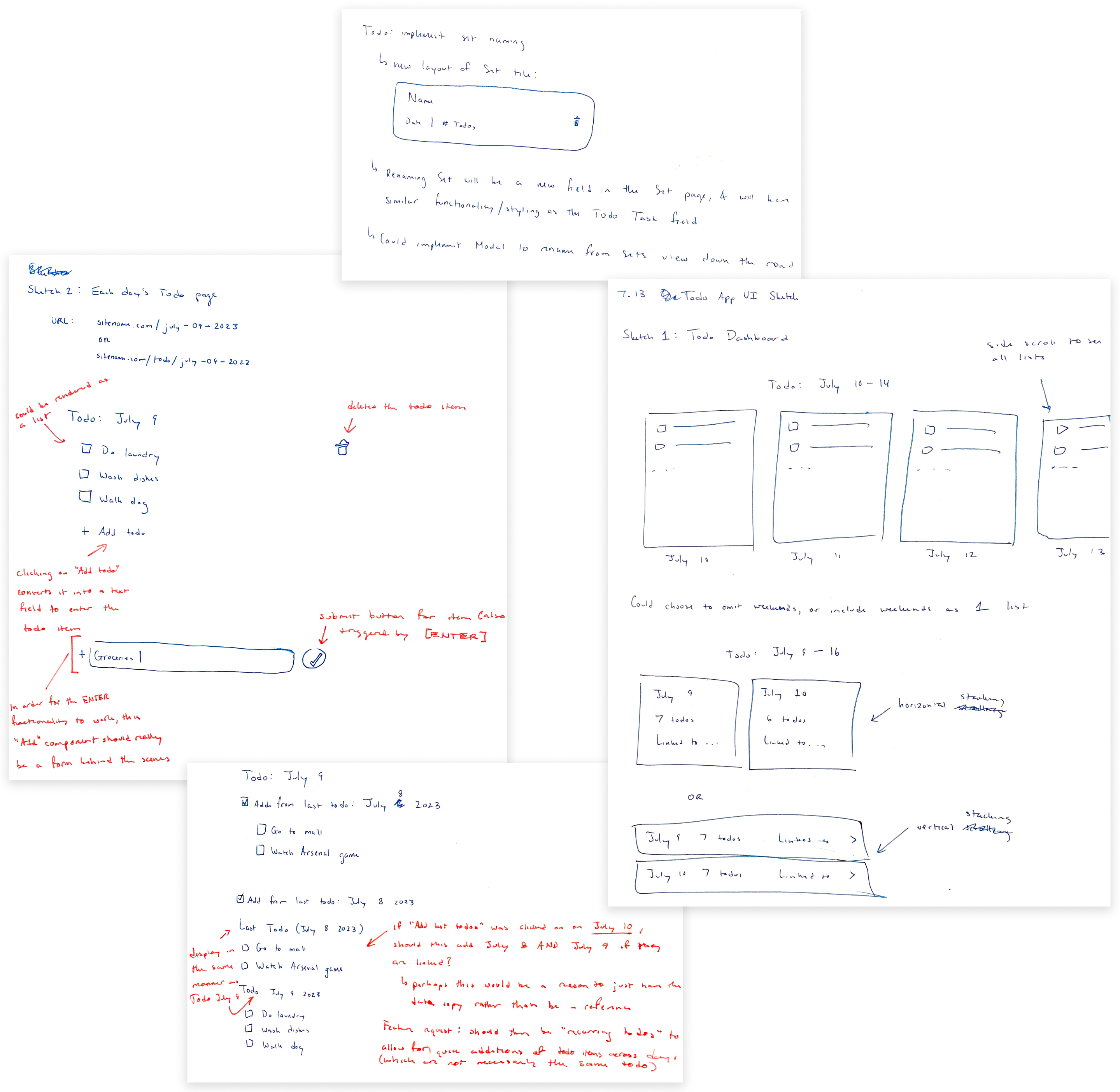

When experimenting with components with a rich set of variants and layout possibilities (i.e text fields), I developed them to a higher fidelity in Figma to physically toy around with their properties.
The completion of Phase 1 left me with a minimum viable product of my todo app, which allowed me to
Of course, I would seize opportunities to improve what I had built when they came along. For every new feature of the app, I went through the following process to nail down the work to be done:

Following the process of Phase 2 development, I implemented additional functionality to the app, including
As I was developing the app, I would sillily refer to it as Toh-doh in passing to my partner. I soon saw this as an opportunity to add a playful and cute branding image to my productivity app.
Derived from the checkmark which demarcates completed tasks, I devised a logo to ground my project as a standalone application.
On top of this, I created a style guide to help keep the look, feel, and branding of my app consistent.


Clicking on a Set allows you to see the list of todo items assigned to it.
You can change its status or task text, as well as add/remove any item you wish.
In addition to viewing the todo items that belong to a single Set, you can view a running list of all your todo items across Sets.
This gives you the highest-level perspective of overall task completion.


Adding your personal touch is easy with the ability to adjust the Profile picture that is shown throughout the app.
Research by Neilsen Norman Group tells us that among other benefits, skeleton loaders — which take the place of content area until it is ready to be shown — help reduce perceived loading times.

To reduce clunkiness for what is a form-heavy UI, inputs are styled to maintain the suggestion of interactivity while being less distracting.

Inputs styled to maintain visibility and brand consistency at all levels and methods of interaction.

To prevent errors from popping up on slower networks, the intermediate states between interactions are limited but styled to make this less overt.

Inspired particularly by ChatGPT's main textbox, I sought to replicate all details of its implementation and expand my knowledge of what is possible with inputs.

From mobile to desktop, the visual and functional experience of Toto is optimized.
Status:
The site is hosted on Render here. Feel free to create an account (just remember the email and password 🤗) and you can use the app for yourself!
If you notice any bugs or would like to suggest improvements, please contact me!
This project taught me so much about the foundational procedures that go into a database-backed web service. From using tokens to authenticate users, to facilitating database requests and serving their responses, to lots of work with React to handle all the visual states, I learned the processes and technologies for developing a MERN-stack application.
It is known in the developer community that much of one's time goes into debugging — ironing out the problems that result from erroneous code — rather than the code itself. I certainly found this to be the case; however, it is also critical for design to meet development, and assess the aesthetics of the final product as well. Having witnessed this at my previous company, and now being able to empathize with the process of quality assuring features, I know how to better validate the end product of development.
As I have mentioned a couple times before, there are lots of micro details and moments which need to be accounted for when dealing with database-backed web services. From loading animations, to limiting user interaction and preventing improper behavior, to showing different content depending on a user's data, a designer should be aware of how these states should be aesthetically shown, and when in the interaction flow they may be required.
Toto is far from over!
Fitting the content — especially for web apps which can size down to mobile devices — is always something to be wary of. I'd love to explore the ways in which the UI design can better support viewing content on these smaller screens.
Who doesn't like being more secure online? I am intrigued by the potential integration of services such as Auth0 into my app, which allow users to login with providers like Google and Facebook.