Created the company logo and style guide, ensuring iSonic had a consistent mark across mediums, contexts, and scales.
Skills Utilized
Branding
Graphic Design

Created the company logo and style guide, ensuring iSonic had a consistent mark across mediums, contexts, and scales.
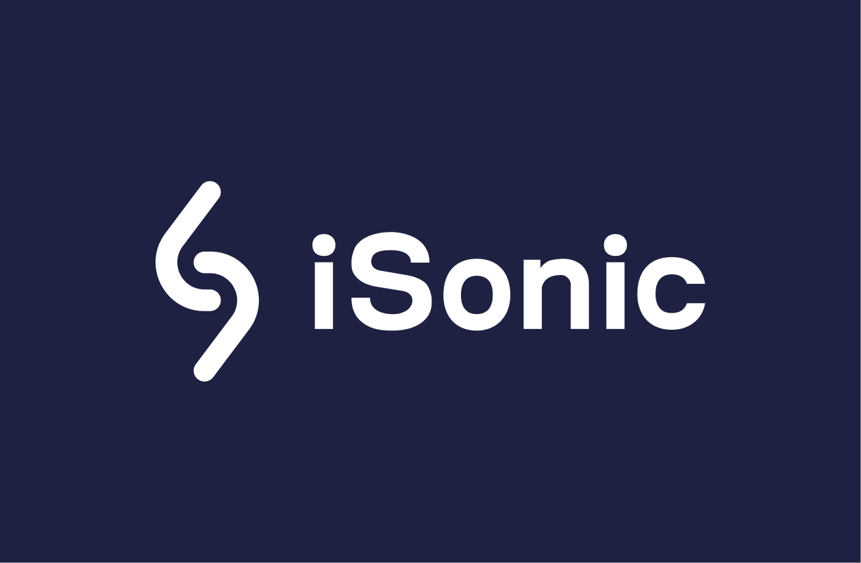
When creating the logo for iSonic, I wanted to convey the idea of service that operates with speed and efficiency while also tying back to the premise of the product: to connect a creator to their audience through engagement with their content.
This identity, paired with references to the symbols of the brand's name, gave rise to its logo.
iSonic connects creators to their audiences
iSonic operates quickly when delivering responses to visitors across its AI touchpoints
Abstraction is minimized, and a trace of “iSonic” can be recognized through its wordmark
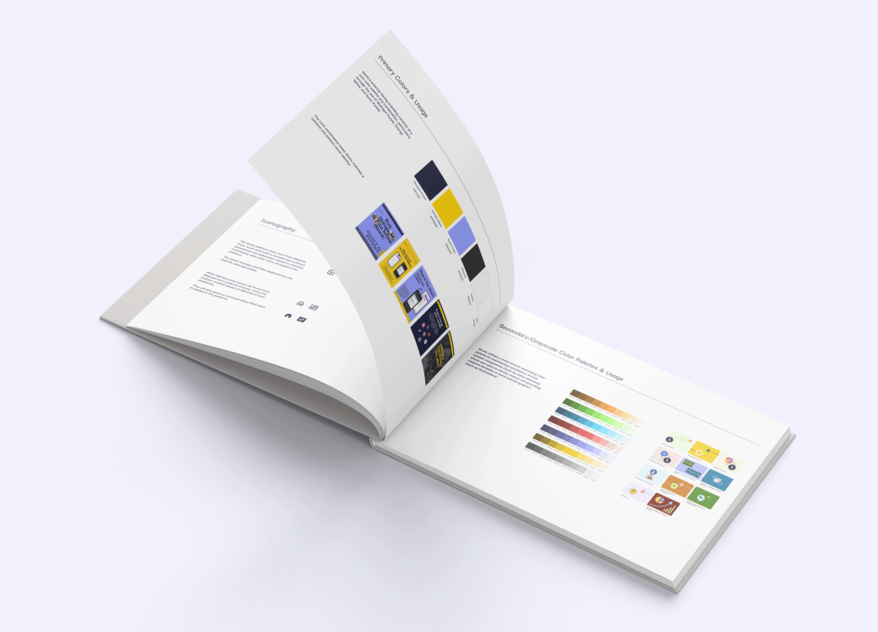
I wanted to ensure that iSonic possessed an identifiable color scheme that could appear well across core product and marketing collateral.
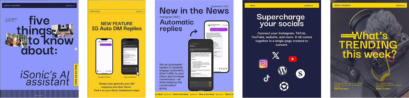
The primary colors were chosen to not clash with typical interface component and status colors, and iSonic’s external-facing branding consists of this core color palette, particularly through the use of Midnight Purple, Energy Yellow, and Sonic Purple.
This palette helps iSonic maintain a cohesive and distinct visual identity.
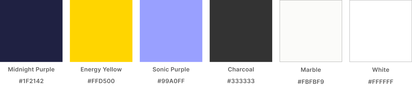
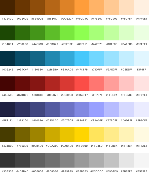
The secondary colors were chosen to provide a diverse secondary color palette for maintaining consistency across system components (such as status elements which use color to convey status) and providing creative flexibility in more internal graphics (such as illustrations)
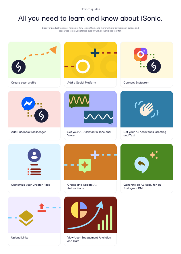
I put together a style guide for iSonic, providing documentation of typography, iconography, logo usage, and colors that can be used both internally and externally.