Redesigning the end-to-end entry of creators onto iSonic’s platform: Signup, Onboarding, and Dashboard Revamp
Skills Utilized
UX Design
Frontend Engineering

Redesigning the end-to-end entry of creators onto iSonic’s platform: Signup, Onboarding, and Dashboard Revamp
From developing iSonic from its MVP through to its first few users, we were making rapid iterations to everything from the core product experience to how data and accounts are connected. This was great for getting early validation about specific features and product direction; however, I noticed some shortcomings and negative experiential factors.
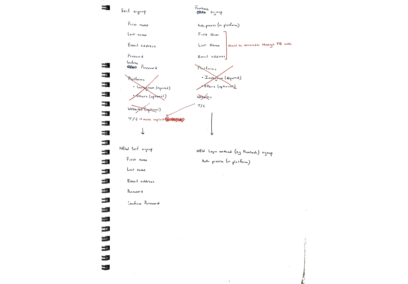
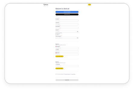
We used to require social media profile URLs to retrieve information needed to support their AI Assistants.
However, once we implemented better processes beyond MVP (e.g. connecting social media platforms through official authentication), such information no longer became relevant and only added signup friction.
As core product offerings and infrastructure developed, I observed that creators did not have visibility into what was happening after taking certain actions in the UI.
This lack of transparency was making it more difficult for not just creators, but even less technical team members trying to test product functionality, to know what was going on and answer questions.
From developing iSonic from its MVP through to its first few users, we were making rapid iterations to everything from the core product experience to how data and accounts are connected. This was great for getting early validation about specific features and product direction; however, I noticed some shortcomings and negative experiential factors.
As I participated in customer calls, creators often cited confusion with the post-signup product experience, particularly with understanding whether their content platforms were connected or not, or if there was anything to do next before being able to see content with relevant responses through their AI Assistant.
I connected these customer grievances to violations of usability heuristics such as visibility of system status, user control and freedom, and [enabling users to] recognize, diagnose, and recover from errors.
I established the fulfillment of these heuristics as functional product requirements in order for the team to both understand the user problems associated with the requested changes, as well as provide acceptance criteria for product experience.
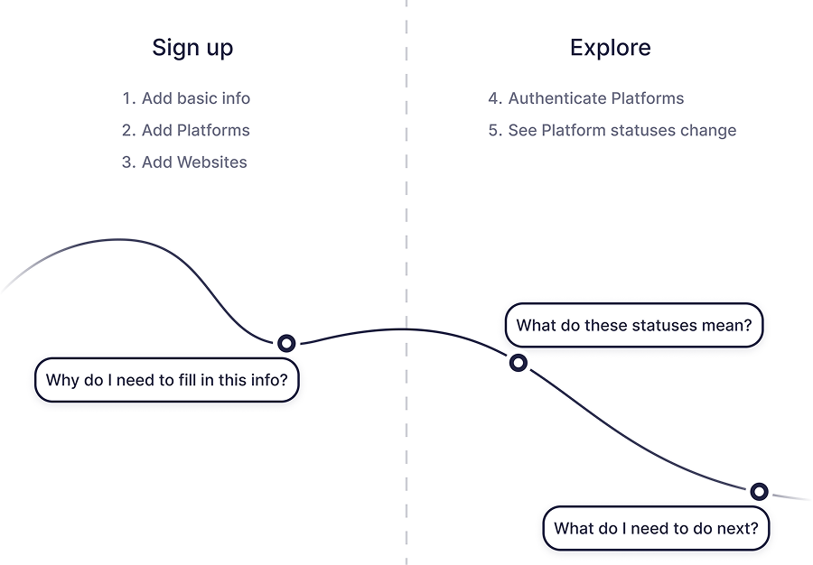
After extracting insights/conclusions from the customer conversations and heuristic evaluation, I put together a journey map to illustrate the creator’s mental state as they went through the signup and post-signup product experience.
Having worked on features and experience of the product before raising this initiative as well as continuously collaborating with engineers, I observed how technical processes changed and how the UI fell short in properly reflecting system status from these changes.
Therefore, the first thing I explored was how to make the initial signup as concise as possible based on up-to-date product requirements.
Some existing features could be omitted entirely; for example, collecting creator social media profile URLs independently from official authentication was no longer needed.
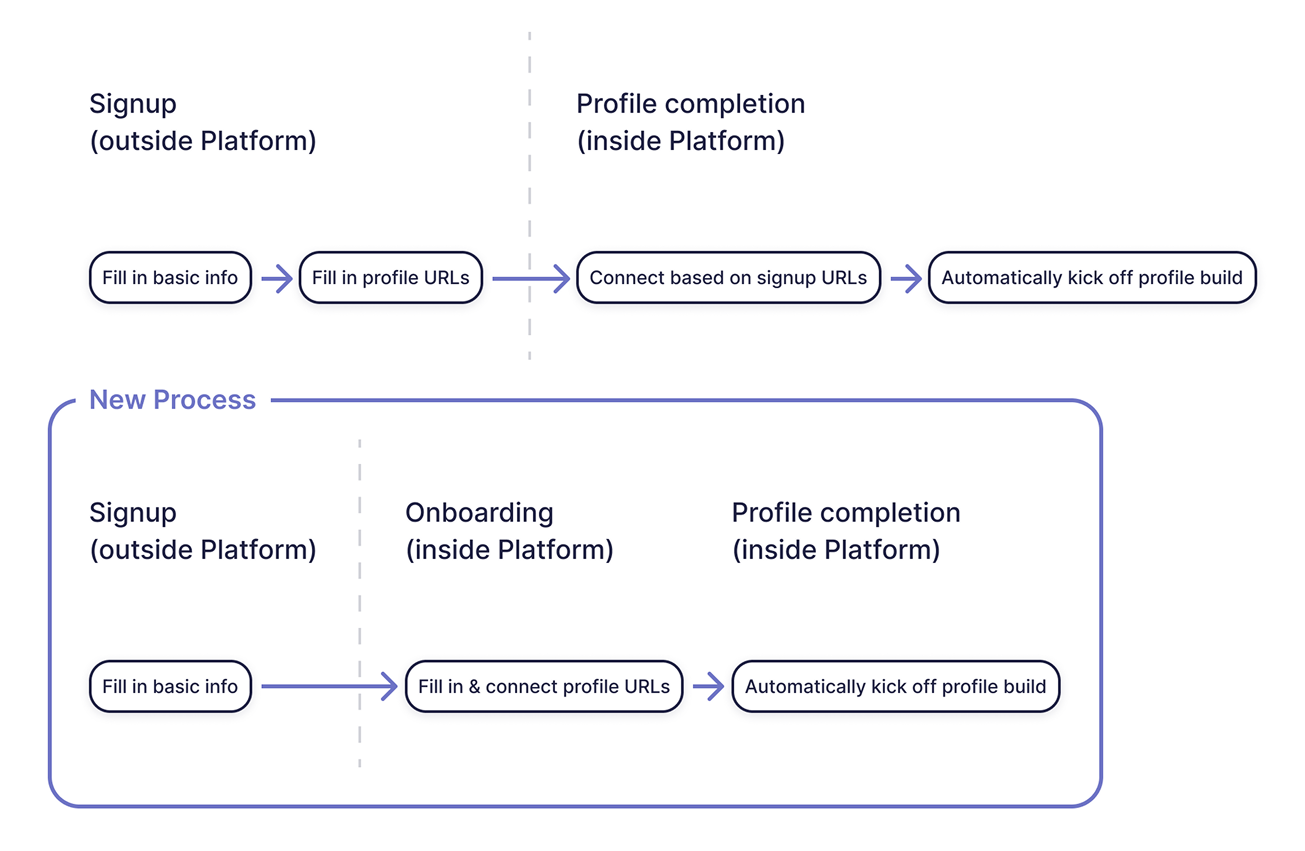
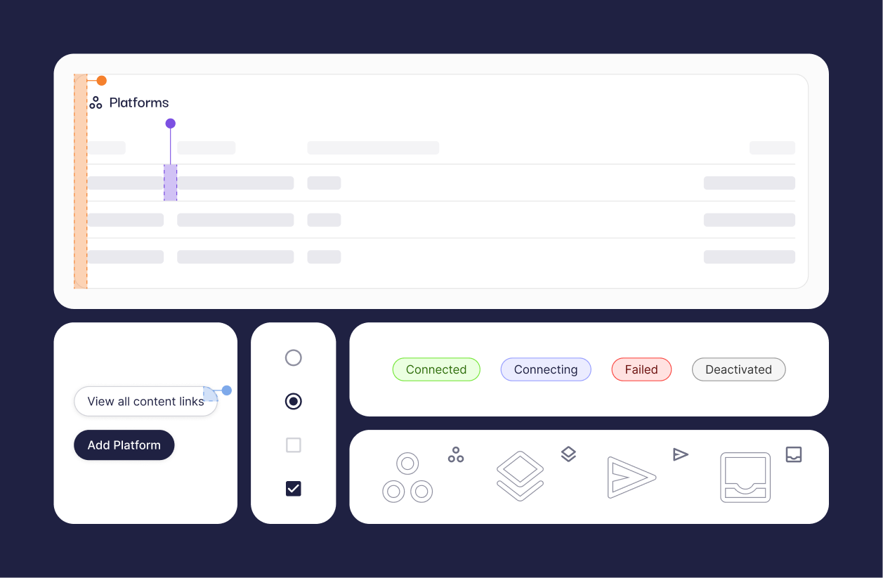
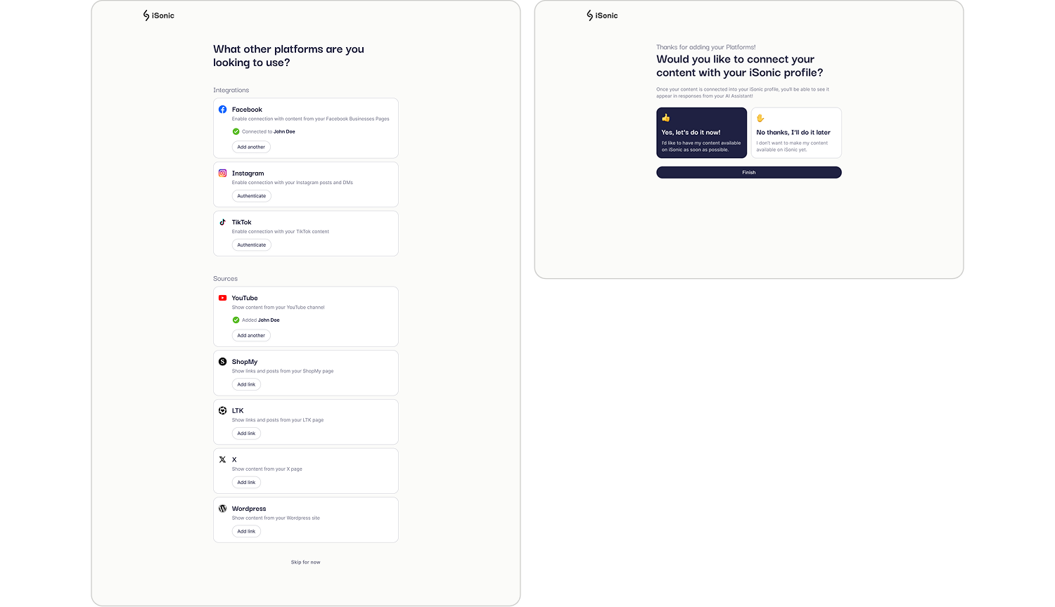
We found from user feedback that there was increasing need to make individual profile connections more streamlined. The process was cumbersome —creators would enter their URL during signup, see a notification of further actions to set up their account, go through a profile authentication process, and only then see that their profile was ready to connect.
I wanted to ensure that rather than having this fragmented process, creators could instead complete the action in a single context and flow, making it more simple and easy to understand.
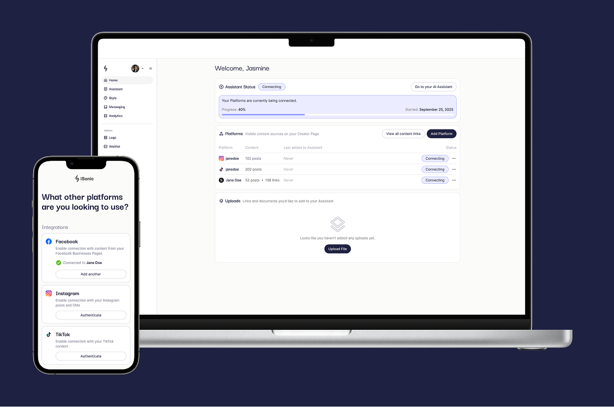
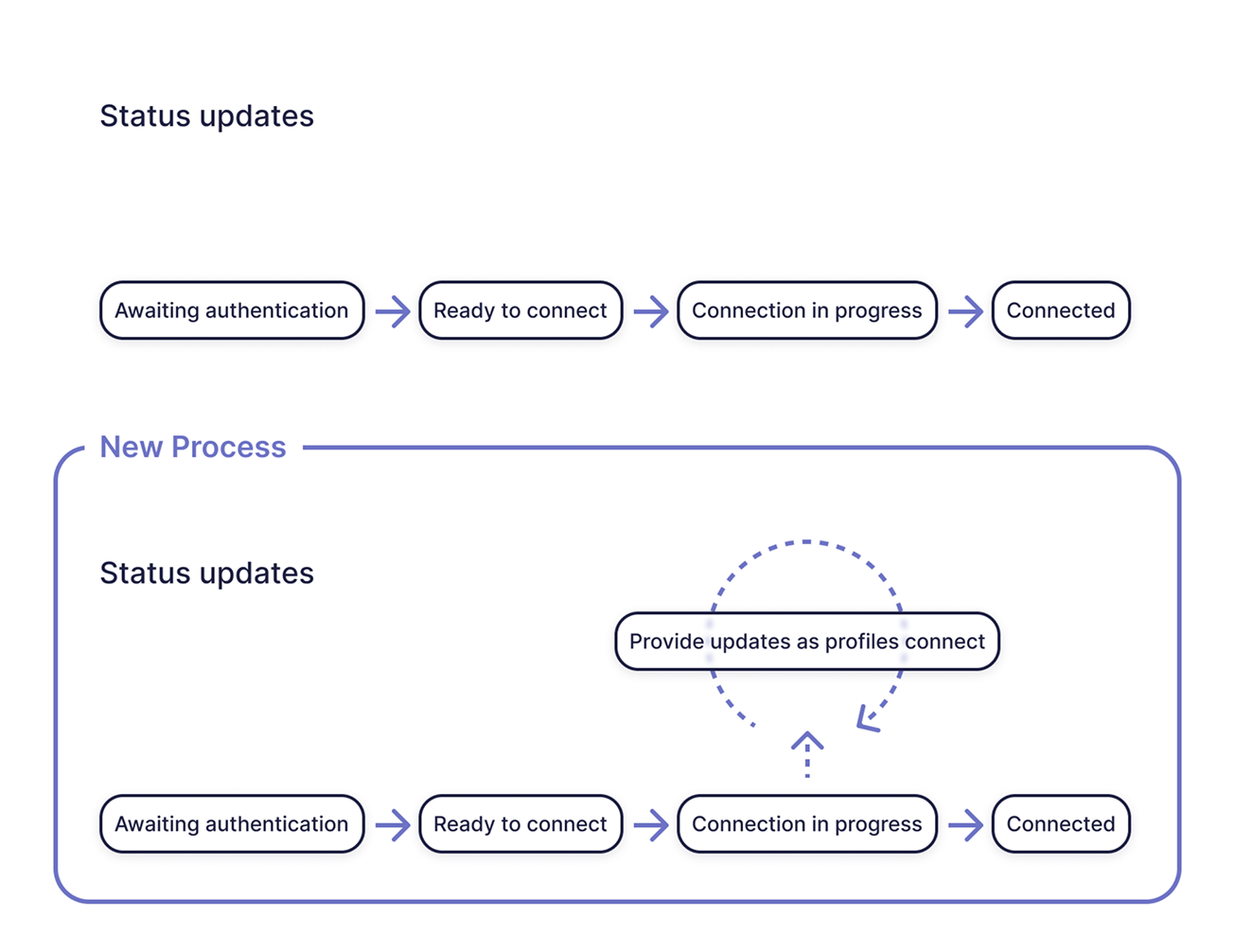
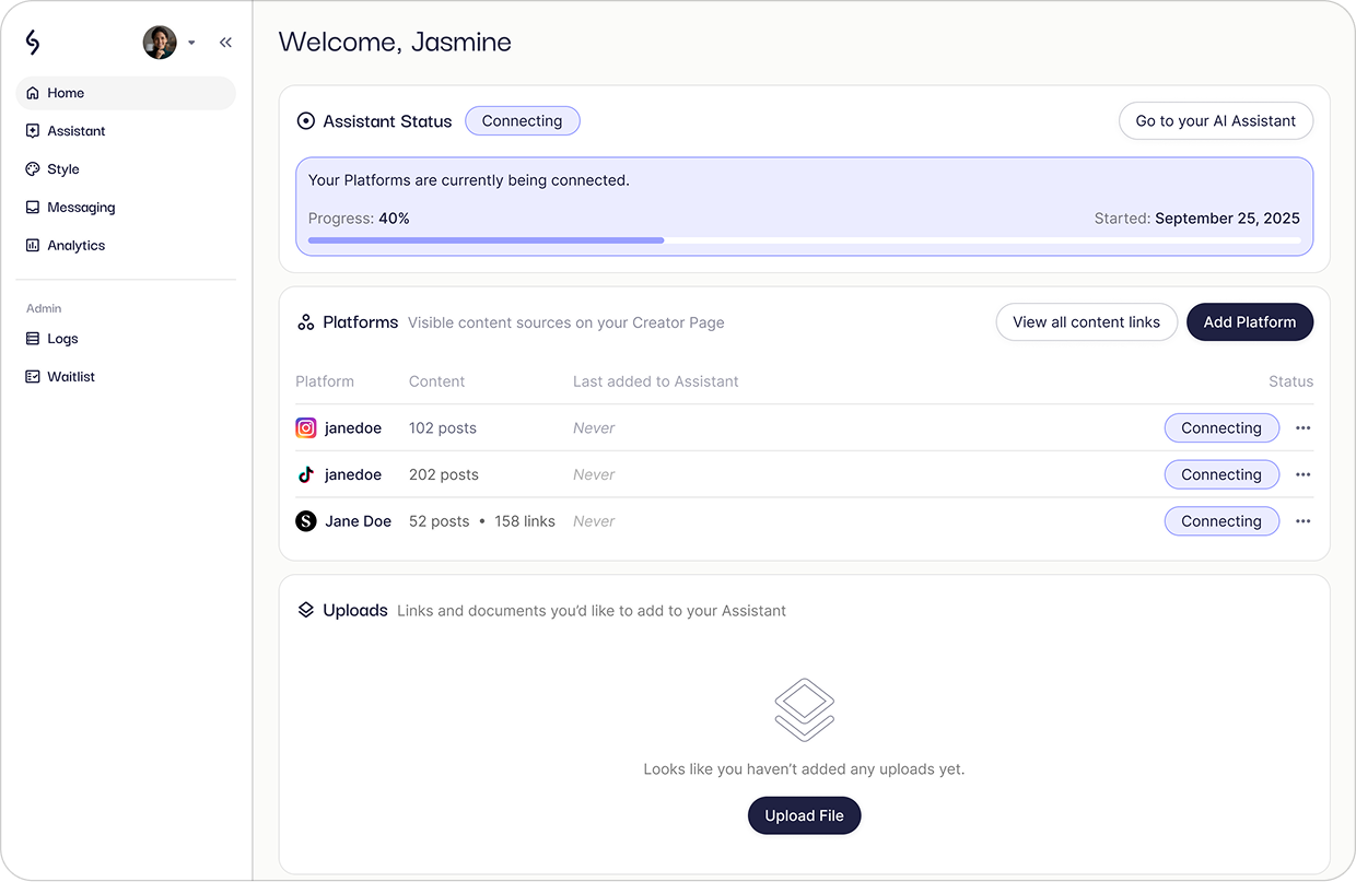
While being a pain point in the creator’s experience of iSonic, I knew that the time our platform required to process data was a technical constraint. However, after collaborating with engineers to understand the process in more detail, I learned that we could make strides in displaying higher-fidelity updates on profile processing.
With this detail in mind, I explored new ways for us to set better expectations for creators around processes that, while integral to the platform’s operation, might take some time to complete.
Having worked on features and experience of the product before raising this initiative as well as continuously collaborating with engineers, I observed how technical processes changed and how the UI fell short in properly reflecting system status from these changes.
Therefore, the first thing I explored was how to make the initial signup as concise as possible based on up-to-date product requirements.
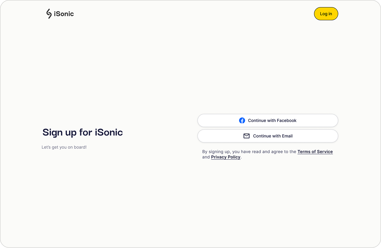
Signup is now a single decision —self signup (entering a manual form) or a familiar login method such as Facebook.
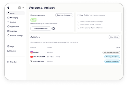
After the initial signup hump, the creator receives instructions providing progressive exposure to the platform and gains a better understanding of it one step at a time.
From visibility into system status, to a better defined visual hierarchy and display of what to do next during different moments of product use, creators now have greater agency and control over platform actions.
Reduced minimum amount of iSonic signup form clicks by 85% in the best case (using login method to sign up), and 13% in the worst case (using email and full form to sign up)
Designed a workflow to add platforms completely in 1 continuous action instead of breaking it up into 2, resulting in a significant reduction of UI complexity
Created new UI elements to provide the first communication of ongoing system status to the creator, ensuring they understand what is happening and by when it is expected to finish.