iSonic Design System

Standardized the look and feel of components, simplified the application of platform styling to enable modular theming (such as the choice between light and dark mode), and implemented a new navigational structure and to support the visibility and extendability of features

Skills Utilized

Information Architecture
Design Systems
Frontend Engineering

The Project

Scope

Design

  • Redesigned platform components to be more atomic and accommodate future feature growth
  • Laid out a revised information architecture that better promotes feature discoverability/scalability and a creator’s ability to traverse the platform at any moment
  • Specified more graceful micro-interactions (e.g. loading states, empty content placeholders)

Engineering

  • Implemented everything I defined in the design
  • Centralized the platform’s theming, reducing ad hoc element styling and simplifying both the definition and usage of components across the platform

Revising the Navigation and Information Architecture

I knew that improving the platform’s navigation along with its information architecture were 2 of the major underpinnings of this project. Therefore, I wanted to investigate how the platform structure could better afford feature discovery and scalability while enabling easier decision-making for where new ones could live once implemented.

I documented the platform’s navigation at the start of the project to better understand where future improvements could fit into the user experience.

Old

As more features were added to iSonic, the interface did not provide optimal navigation around the platform, with each panel in the Dashboard essentially being the only way to access different pages.

New

As a result of the revised and defined information architecture, I added a side navigation accessible throughout the entire app, making the app’s structure more clear and intuitive throughout the experience.

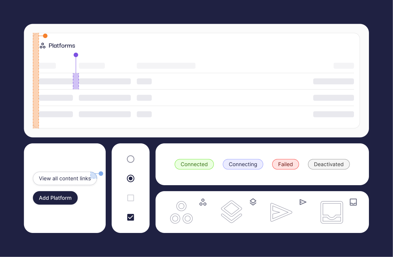
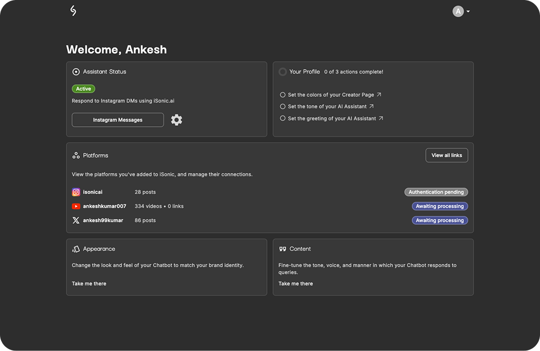
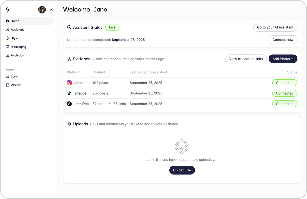
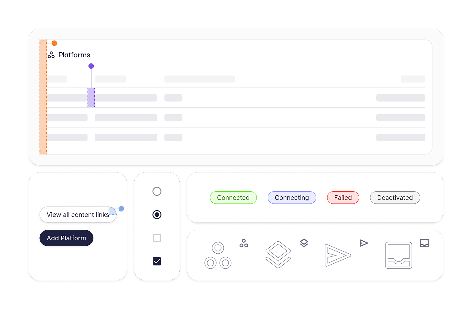
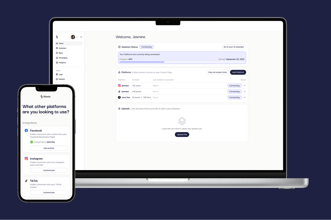
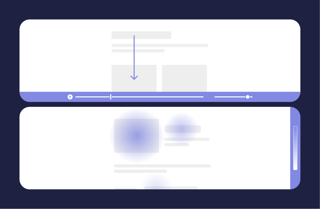
Introducing a revamped design system

To make the platform feel cohesive both in its current and any future state, I took it upon myself to design and implement a new design system, making it easier than before for any developer on the team to create their own features without a strict design overview.

My aim was to give the developers more confidence that the interfaces they could create from pre-defined components would align with standards set from previous features that had longer design phases.

With time always being a limiting factor during the rapid growth of a 0-to-1 product, I wanted to ensure that development friction was reduced where possible —and this felt like the right place to do it.

From defining an icon visual style, to establishing colors to consistently communicate system statuses, to implementing and documenting standards for component theming, I ensured that the new design system would be set once and applicable across product contexts.

Outcomes

Adoption

The design system became used across nearly 100% of the product, establishing new standards and defining the visual identity of iSonic’s entire platform.

Scalability

Made it easier for the entire development team to make initial decisions about where to place new features.

Source of truth & modularity

Structured the frontend in a way that enabled platform-wide styling within one file, permitting more modular theming (e.g. light/dark mode) and simpler implementation of interface components.